Colors stand at the heart of the creative process: one only needs to picture its rainbow-shaped display or the walls covered with colorful post-it notes, the trademark of any brainstorming session. Although the pure aesthetics of it are indeed quite pleasant, colors also have a way of conveying a deeper appreciation of the creative process.
You may find your inspiration in colors’ mainstream acceptations or come up with your own personal pallet: either way, they add a creative layer to your facilitation techniques. This is why we decided to give you the opportunity to add colors to your workshops in any way you wish so you can keep better track of your ideas at every step of the process and instantly identify them among all others.
1 – Colorful clusters to distinguish ideas
In order to color up your workshop, the first step consists in applying a color to the clusters of your choosing from the Card or Canvas view: this color will be applied to the cluster during the whole course of the workshop, on the canvas, the cards, the histogram or bubble graph. For instance, when you drag’n’drop a card, you can more easily identify the targeted cluster because of its distinctive color.
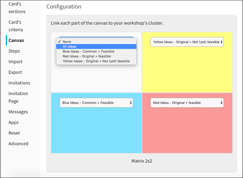
When creating a canvas, you only need to go to the workshop’s settings to choose its shape as well as the way the areas will be allocated. Each area of the canvas will automatically showcase the title, color and illustrations of their matching cluster.
 For instance, we recreated here the COCD Box workshop that you can use during your meetings.
2 – Colorful results for a more meaningful interpretation
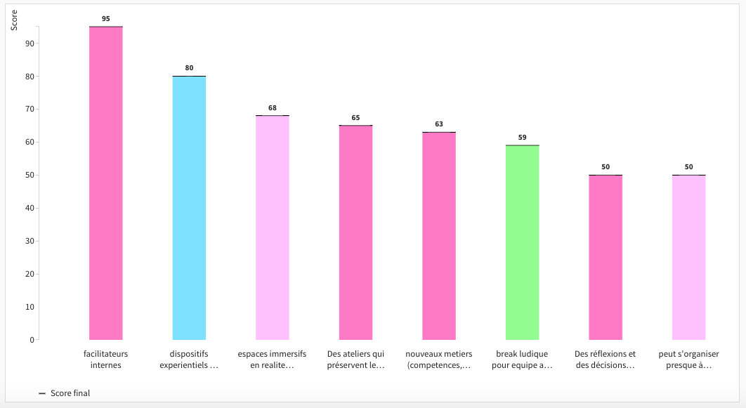
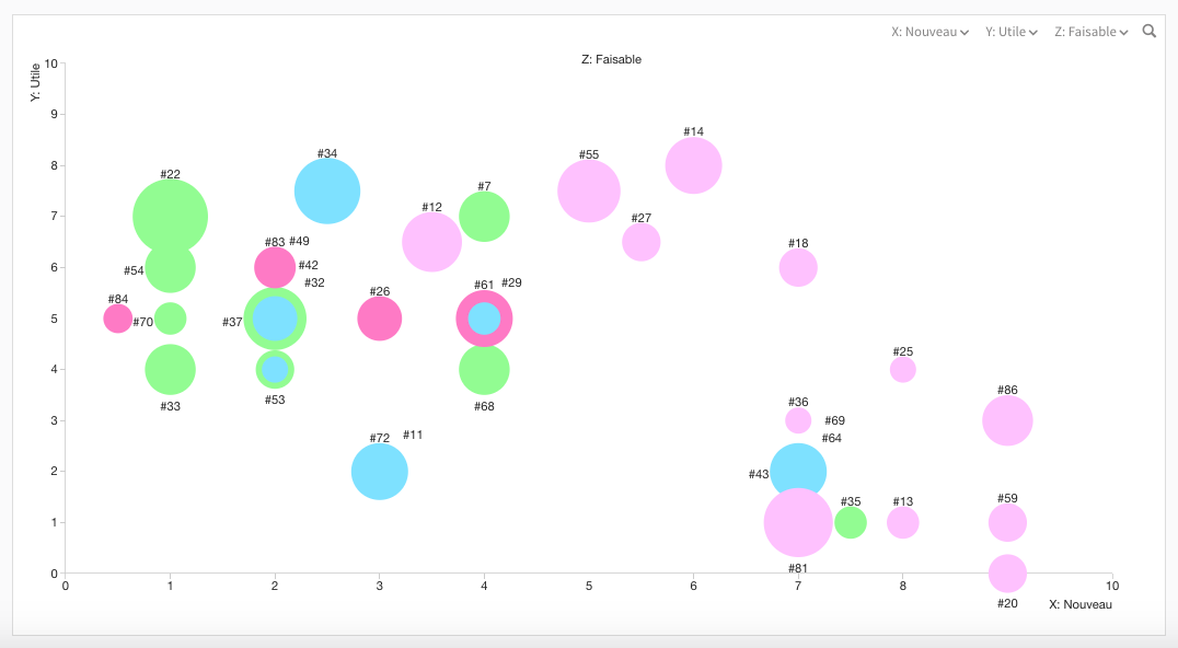
A color doesn’t only serve the purpose of a wallpaper, far from it. It is a distinctive and outward sign shared by all related cards. When displayed in a bubble graph or histogram, a card automatically takes on the color of its cluster. This creates a remarkable continuity and enables us to easily keep track of ideas and to analyse them being well aware of the cluster it originated from. The histogram, for instance, will clearly show the sources of each card, therefore making it easier for you to identify where the best contributions are coming from. You can now use the colors to differentiate clearly the inputs of two clusters and compare the results after a vote session.
 The results of a cluster’s cards also provide us with a lot of information about the cluster itself. The way the colors are laid out in a bubble graph increases our knowledge of the cluster’s own features. In the example just below, we can easily see how the ideas formulated by the Pink cluster are considered particularly ground-breaking.
 You can even, from the histogram, sort out your cards by clicking on them and on “move”. Since the colors are constantly updated, you will be able to keep track of your sorting process while the participants will enjoy a great visual display.
To conclude
Colors enable you to add an additional layer of information that you can use as you wish. It’s up to you to master this feature to enrich your workshops by making them more meaningful or simply more pleasant to watch. If you happen to have ideas on how to use the color pallet, don’t hesitate to share them with us ;)
