After launching the Quiz and before talking about the Event page, we made a couple of tangible improvements to increase the scope and depth of Stormz workshops. All these upgrades address one simple challenge: to foster the group’s collective intelligence, the facilitation should be as meaningful and smooth as possible. Fluidity enables the facilitator to focus on the core of the problem and helps participants feel that the tool is at the heart of their own reflection process.
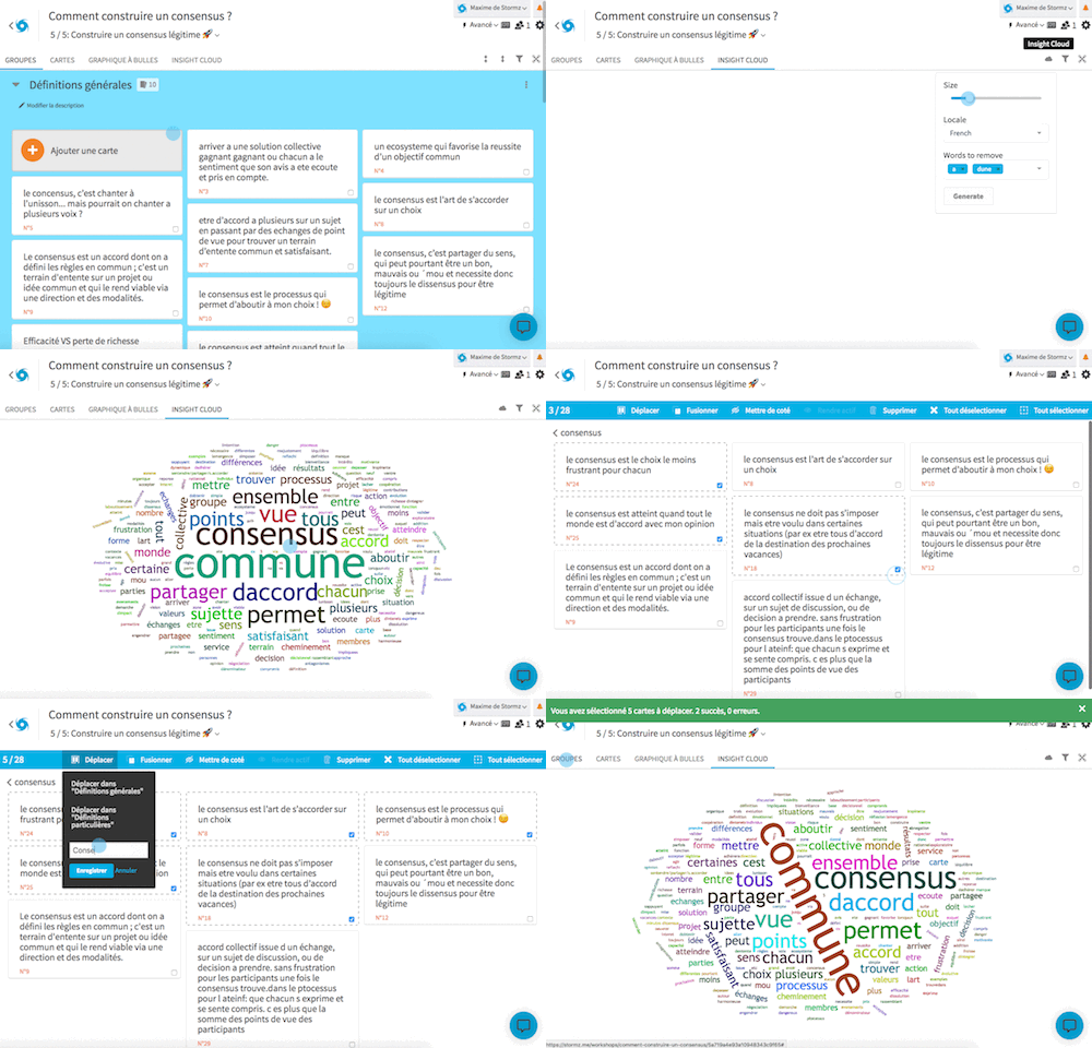
The Insight Cloud is fully integrated to the workshops
You can play with cards directly from the Cloud! This enables you, for instance, to search and sort semantically all the participants’ contributions.
- The cloud is now a view like any other, more accessible and easy-to-use.
- Participants will soon be able to use it on their own tablet! Highly convenient for them to dig deep into a topic or search for a specific card.
In other words, workshops become more coherent, simple and powerful. What more could one ask for?
The Quiz becomes more ergonomic
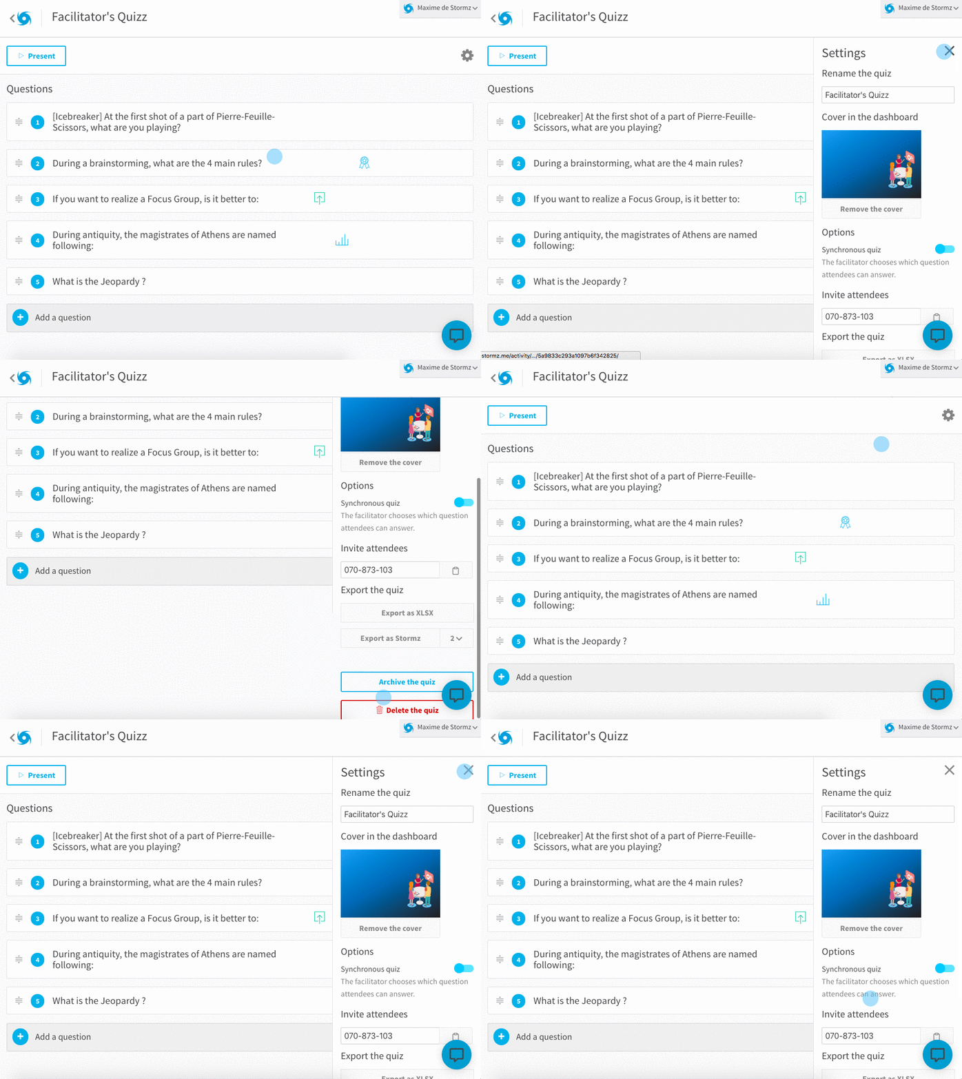
The Quiz settings are now located in a discreet sidebar and the design of the questions has been simplified.
By the way, did you know that you could go back and forth between questions using keyboard shortcuts? P to publish a question, L to block it and R to show the results. And you can also move from one question to the next with directional keys.
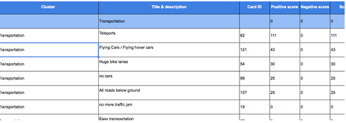
The Excel export is more legible and thorough.
The Excel export’s recent upgrades include:
- A new Group column.
- User information for the contributions in the cards’ sections.
- A few revamps, including less columns.
- The Scores and Criteria columns remain empty if there wasn’t any vote or evaluation.
With Stormz, you can create the whole workshop with a single click: no need for a strenuous and painstaking effort to transpose hundreds of post-its or take pictures of paperboards. You can finally focus on the most important tasks, like the facilitation itself or the synthesis report.
Exports are available for the Workshop and Quiz activities.
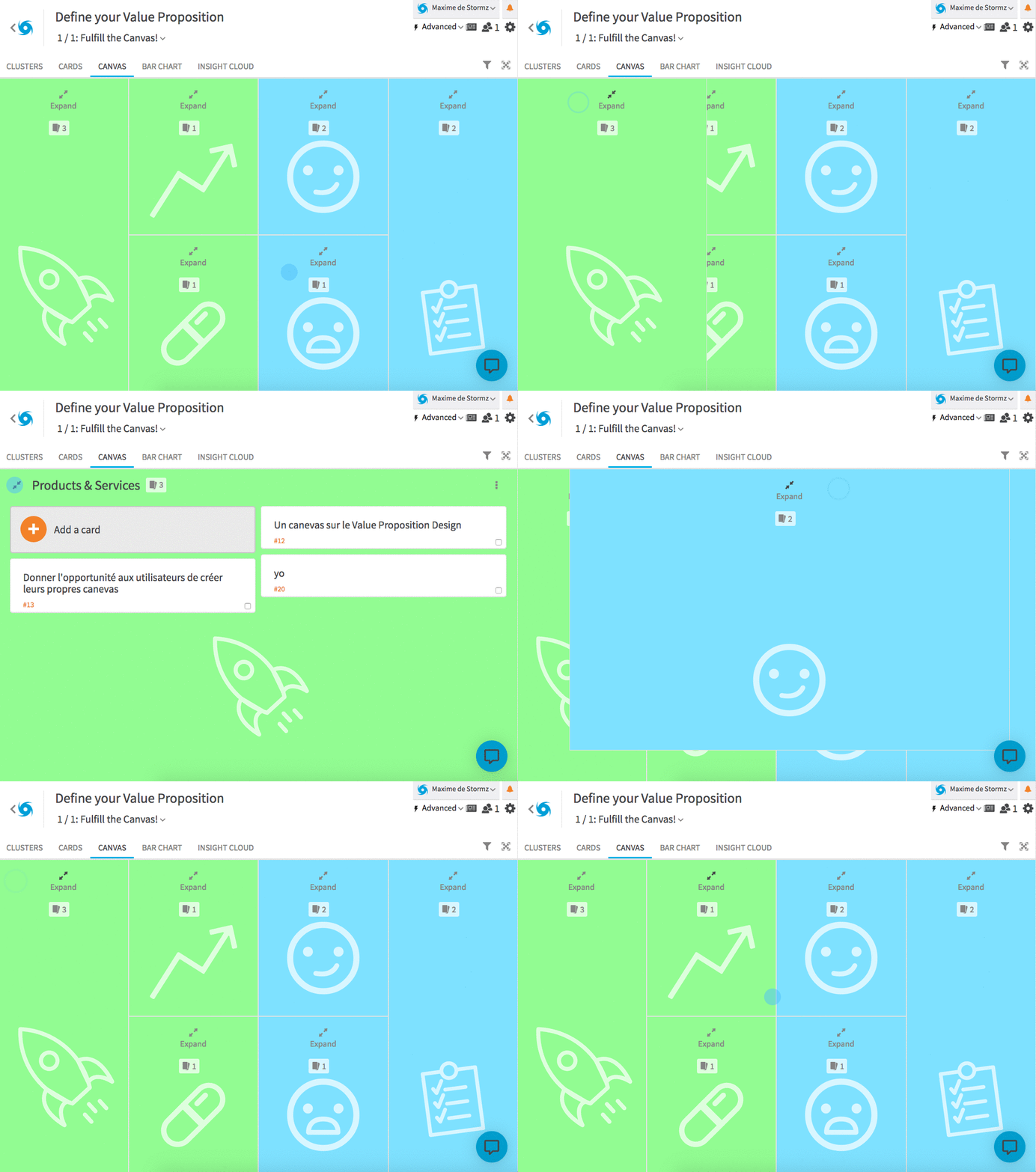
Creating the canvas is easier and much more flexible.
Regarding the sections and evaluation criteria, you can now create and configure your canvases directly from the step-builder. You can also use several ones in every workshop, and therefore focus on one specific part of the canvas or concatenate different methodologies.
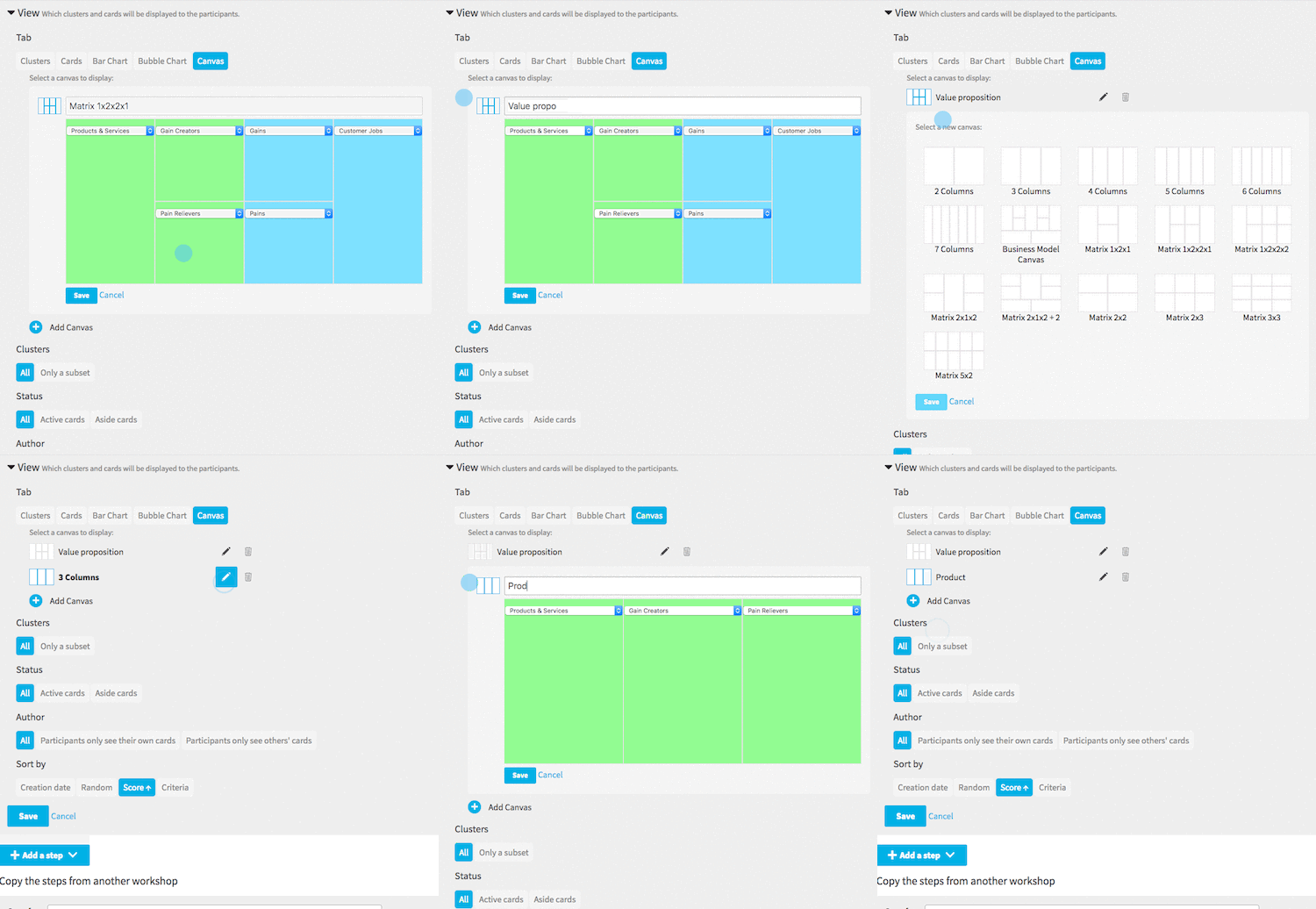 Its user-friendliness is also improved with smaller details, like the title fitting on one line or the canvas becoming uncluttered when the screen is smaller. You can still extend the canvas’ boxes to display all its cards: ideal for a Value Proposition Canvas, for instance.
The Dashboard
To pave the way for the upcoming Event page and optimize the recent arrival of Quizzes, we made a few improvements to the dashboard.
- You can now differentiate the Workshops and Quizzes thanks to a small icon located in the bottom right corner of each activity.
- When an Activity doesn’t have any cover picture, a default colour font is automatically added: blue for a Workshop and orange for a Quiz.
- As a default setting, you can now only see non-archived workshops. You can also archive Quizzes.

The cards’ number
As you may have noticed, with every newly-created card comes a unique number (or ID). For the sake of logic and traceability, this numbering system has only been improved.
- Since Groups are, technically, not considered as cards any more, the first card you’ll create will be assigned the number 1.
- The numbers of merged cards appear in the lower part of the new card, thus enabling you to trace back the origins of each card.
- The cards’ numbers appear more clearly in the pdf and word exports.
- On the bubble graph, you can choose to show the cards’ number or the first words of the cards’ title.
By the way, if you’re using a PC or a Mac, you can use these numbers to look for a card among hundreds of them. You only need to know its number and use the search feature (cmd+F or ctrl+F).
