Do you remember the multi-criteria ratings, this powerful Stormz feature which allows you to assess and evaluate a whole string of concepts (ideas, risks, strategies, basically anything you want) with a series of criteria of your own choosing?
Even at its beginning, Stormz’s multi-criteria ratings were pretty much a unique feature in the collaborative world. But with the latest upgrades, we’re taking it to a whole new level.
Charts and cosmetics
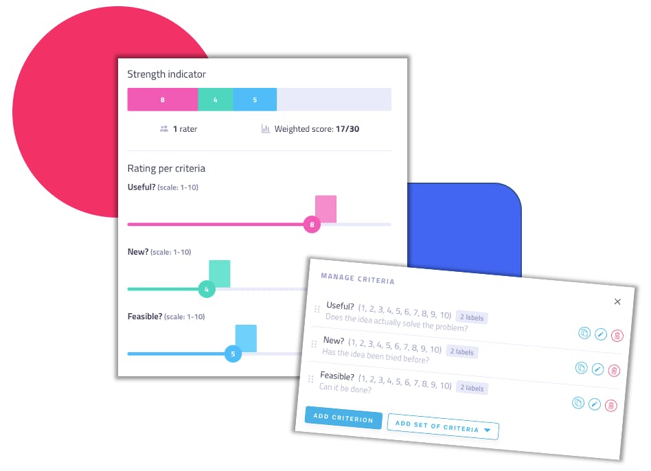
First off, the multi-criteria ratings have gone through a much overdue facelift and adopted an improved visual design in line with the new visual identity of Stormz, which will continue to be progressively rolled-out throughout the year. You can have a sneak-peak with the screenshots below, bearing in mind that every single design has been thought in view of improving the overall experience of both users and facilitators.
But let’s get real. Regardless of the cosmetics, what else has changed?
New charts in cards
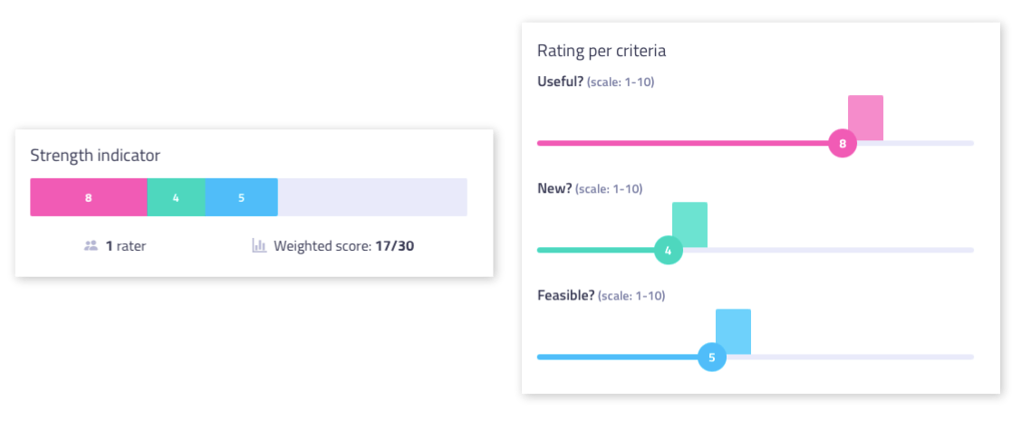
If you’re like us, the upgrade you might feel the most excited about are the brand new charts presenting the results of the ratings of your participants within the card. This updated feature allows you to see, in the blink of an eye:
- the strength of an idea, to see how well an idea performed along the different criteria;
- and the average rating by criteria, to assess the level of consensus (or lack thereof) of each individual criterion.
Compared to our previous charts in cards, these new charts enable you to quickly look into the level of consensus among participants since you can see how the evaluations are spread. With a hover on a bar, you can also see a list of 5 participants who gave this rating : a quick way to start a debrief.
But we’re just getting started. We’re also happy to unveil a revamped labelling system of the multi-criteria ratings with, always, two goals in mind: providing a seamless user experience for participants and multiplying the ability of facilitators to design custom-made evaluation sessions.

Fully custom scales
Considering how some teams and/or organisations are often used to working with specific scales, this can genuinely enable them to create a tool 100% fit to their needs.
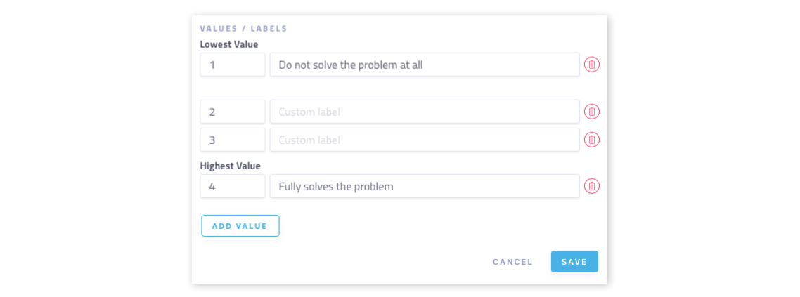
Whereas the choice of scales used to be limited to few generic ones, now, the sky’s the limit: you can customize your scales with an unlimited number of graduations and the customisation of each value.

Labels and descriptions
On top of that, you’ll also be able to take full advantage of the labels and description thanks to our new rating widget: you can now add description to your criterion to improve participants’ understanding of the exact meaning of each criterion (otherwise, participants can understand concepts like “feasible” or “useful” in utterly different ways).
 And you can now also provide specific labels to the graduations (mix & max or all of them) of your scale, thus avoiding confusion (“Is 1 the best or the worst?”). Anyone who has ever organized such sessions are all too familiar with this problem, but it’s all ancient history now. Stormz is the only workshop facilitation app on the market to provide this level of detail.
More upgrades for a seamless experience
And finally, our team has been working round-the-clock to bring specific improvements to let you create multi-criteria ratings sessions even quicker.
You can use templates of criteria
You’re now able to add a predetermined set of criteria (NUF, Desirability/Viability/Feasibility, etc.) in just one click
You can reorder lists of criteria
You can reorder lists of criteria as you see fit and duplicate one or several criteria - including their labels - in an instant.
You are warned before deletion
Better safe than sorry, we’ve also improved the warning alert when deleting criteria to make sure nothing is lost by mistake.

What do you think?
Any new upgrades you’re particularly excited to try out? Let it also be said that this is only the start and that more improvements, including on the bubble chart view, will come in a later phase of our redesign adventure.
