Since a few weeks, we were busy updating Stormz's design. Here is a little summary of what we did.
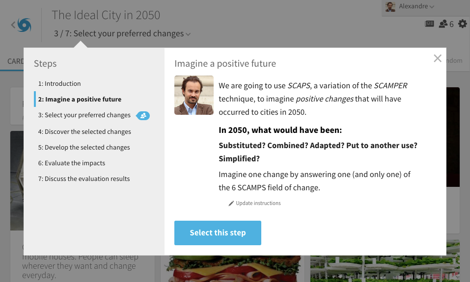
First change, the header. Visually simpler and cleaner. The workshop's title and the step menu are regrouped.
 One click on the current step will display the instructions. The instructions are pushed forward and isolated from the rest of the interface.
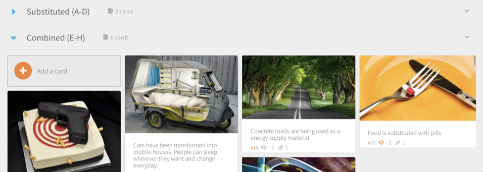
 Group' style has also evolved, it takes less room. The Add Card button is way more visible and attractive.
 Cards have slightly evolved to be cleaner. Attached images are beautifully put forward.
 You like it? You hate it? Leave a comment or contact us by email!
