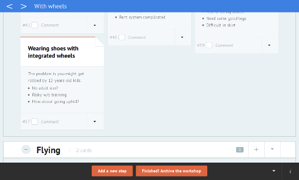
Since the redesign of Stormz's workspace, we are continuously improving the overall User Experience.
Previously the cluster's headers were sticky, they stayed on top of the page to add some context to the cards displayed.
It caused a number of problems, especially with mobile devices such as iPad.
We are now releasing a new alternative, with a navigation bar that appears at the top of the page while navigating between clusters.
 Instead of trying to include all the information of a cluster, we only display its title and navigation arrows.
It's much easier now to go to the previous or to the next cluster!
Last but not least, you can use keyboard shortcuts.
- Shift+j or Shift+down will scroll down to the next cluster
- Shift+k or Shift+up will scroll up to the previous cluster
