Since yesterday, we have begun rolling out a new design for Stormz.
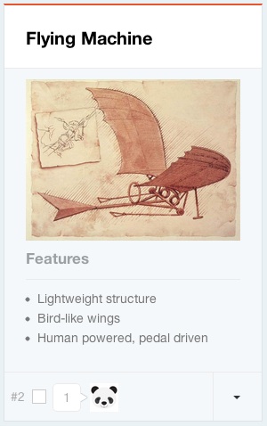
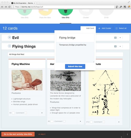
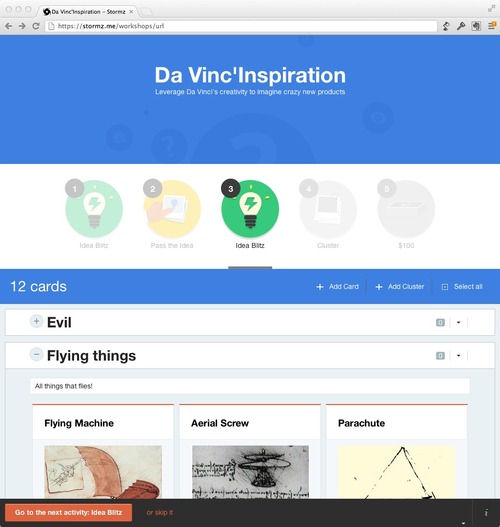
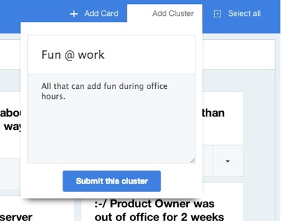
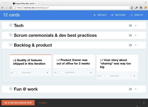
Right now, the new design has only been implemented on the card view. We wanted this design to be more "readable" and we put a focus on clusters that are becoming the main way to structure the content of a Stormz workshop.
Here are a few screenshots of the new design on an Hybrid'up workshop:
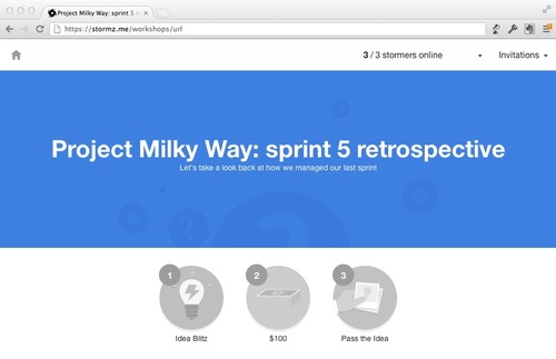
 And a few screenshots on a Retrospective workshop:
 In the coming weeks, we will be gradually upgrading other sections (such as the activities) of the application to the new design. Of course, in the meantime, we are impatient to hear your feedbacks.
