As you have already noticed we have just released the private alpha and are on the starting blocks, ready to listen to your feedback. Meanwhile we have already experimented the Stormz platform with our early adopter partners and have some improvements on the way that I would like to share with you.
So today, let's speak about user interface.
Improvement axis #1 : user interface
OK, let's face it… The product deserves a revamped user interface. Indeed, an application that fosters creativity should be easy to use, fun and visual. Stormz UI although productive and usable is dull and too textual (note to myself: I shouldn't be in charge of the marketing).
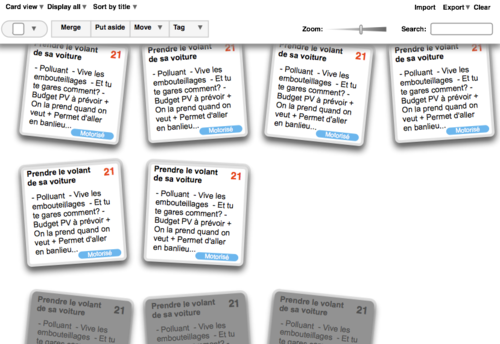
Most of our time right now is focused on a total redesign of the realtime workspace. The main view will display each item visually as a card, each list as a stack or a wall of cards and most of the activity during an activity will consist in manipulating these cards: adding, editing, selecting, appending, tagging, merging, moving, flipping, swapping, throwing, stealing and all these crazy things ending with -ing that you may want to do in a creative workshop…
We are currently prototyping this view and testing how usable it is. Below are snapshots of this rough prototype (be aware that it is work in progress and that visual design will be significantly different).
The basic Card View
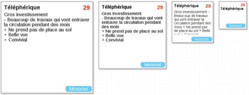
 You will be able to zoom and see more or less details
 We will implement the view, adapt it to the Idea Blitz activity and push it to the platform as soon as possible so that you can play with it.
So do you think card views are the right way to go?
-- Alexandre (@ineation) from the Stormz Team
