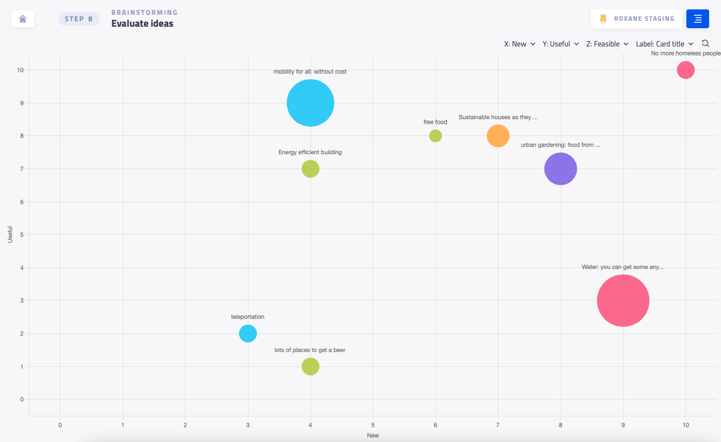
A bubble chart is a graphical representation of data that uses circles (bubbles) to represent the data points.
Display the bubble chart
- Go to the Display menu in the facilitator bar.
- Select the BubbleChart tab.
The horizontal and vertical axes of the chart represent the first and second criteria, while the size of the bubble represents the third criteria.
You can set as many criteria as you want for your rating sessions, but only the first three criteria will be shown on the chart.
Interact with the chart:
- Hover over a bubble to see the ratings for that data point.
- Click on a bubble to open the corresponding card and view the detailed results.
You can also edit the chart options to customize how the data is displayed. For example:
- Assign each criteria to one of the three axes.
- Display either the titles or ID numbers of the cards.